
http://www.powerful-sample-resume-formats.com/images/combo1.gif
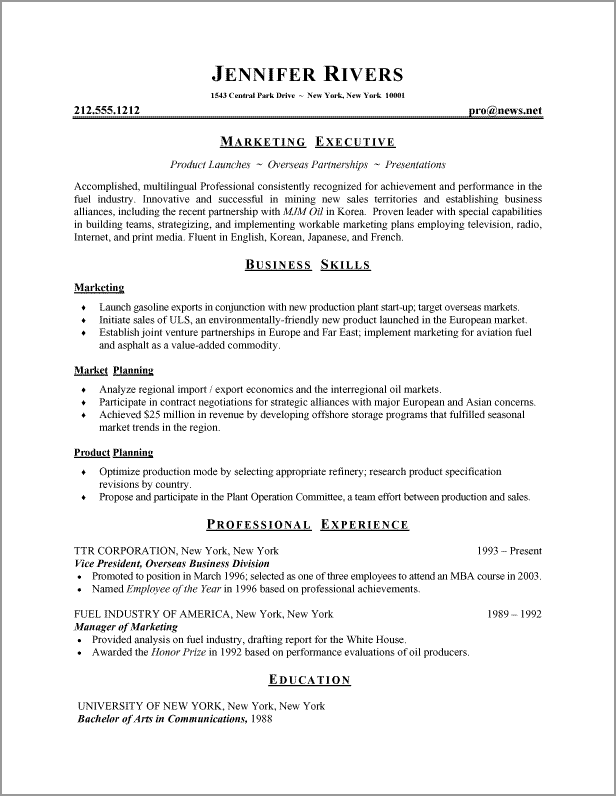
The resume that I chose for this blog assignment, is Jennifer River’s resume. The reason why I was attracted to this resume was because of the organization of it, the use of bold text, and the use of underlining certain words.
I think Jennifer did a great job of stating her skills. She didn’t include any off topic information—she stuck to her main business skills and how these skills would help her succeed in a job within this field. Another major aspect of her resume that I think is great, is the way that she writes. It’s very to the point and not wordy at all. I think this is very important in a resume. She didn’t say anything unnecessary and she kept it short and simple.
I really like how she has her name in such a large print. But I don’t know why she needed to capitalize every letter in all the bold print. I think she could have done without that. It would be more cohesive if she didn’t use capitalization in this way. I also think that the resume kind of looks off balance. I think that it would have looked better if she stuck to the left hand side of the page. Instead of centering the bold words, such as marketing executive. I think it would look more clean cut and business appropriate if she just used the left hand side of the page. It looks pretty, but I don’t think that’s the point of a resume nor do I think its necessary. I think that the top part where she put her name, address, etc is off. I think it would look better and more professional if the writing was on the left hand side of the page once again.
Another thing that I noticed was that she italized the words underneath marketing executive. I think she should be more consistent and keep it simple. Although I do like the bold letters for the titles and the underlining, I don’t think she needed to use italics. It’s just a way to make it look pretty and I don’t think its necessary at all.
Jennifer did a good job of spacing. I think that it was good that she didn’t put spaces between every bullet point. I think it’s important to have your resume fit on one page. If someone is reading your resume and has to flip to the next page, I think that its distracting and maybe too lengthy. I think she did a good job of indentation where the bullet points are, and of keeping the spacing to a minimum.
I think this resume is intended for a business job. She doesn’t use long overdone sentences, and she is to the point. I think that every resume should be like this no matter what job you are going for. The people who are reading your resume want to know the facts right away. They don’t want to be reading any lengthy story about your life and previous jobs. It’s important to get your message out there and be to the point and concise. I think that Jennifer’s resume did a great job of this! Although I would change a few things when it comes to the text and the different fonts.
